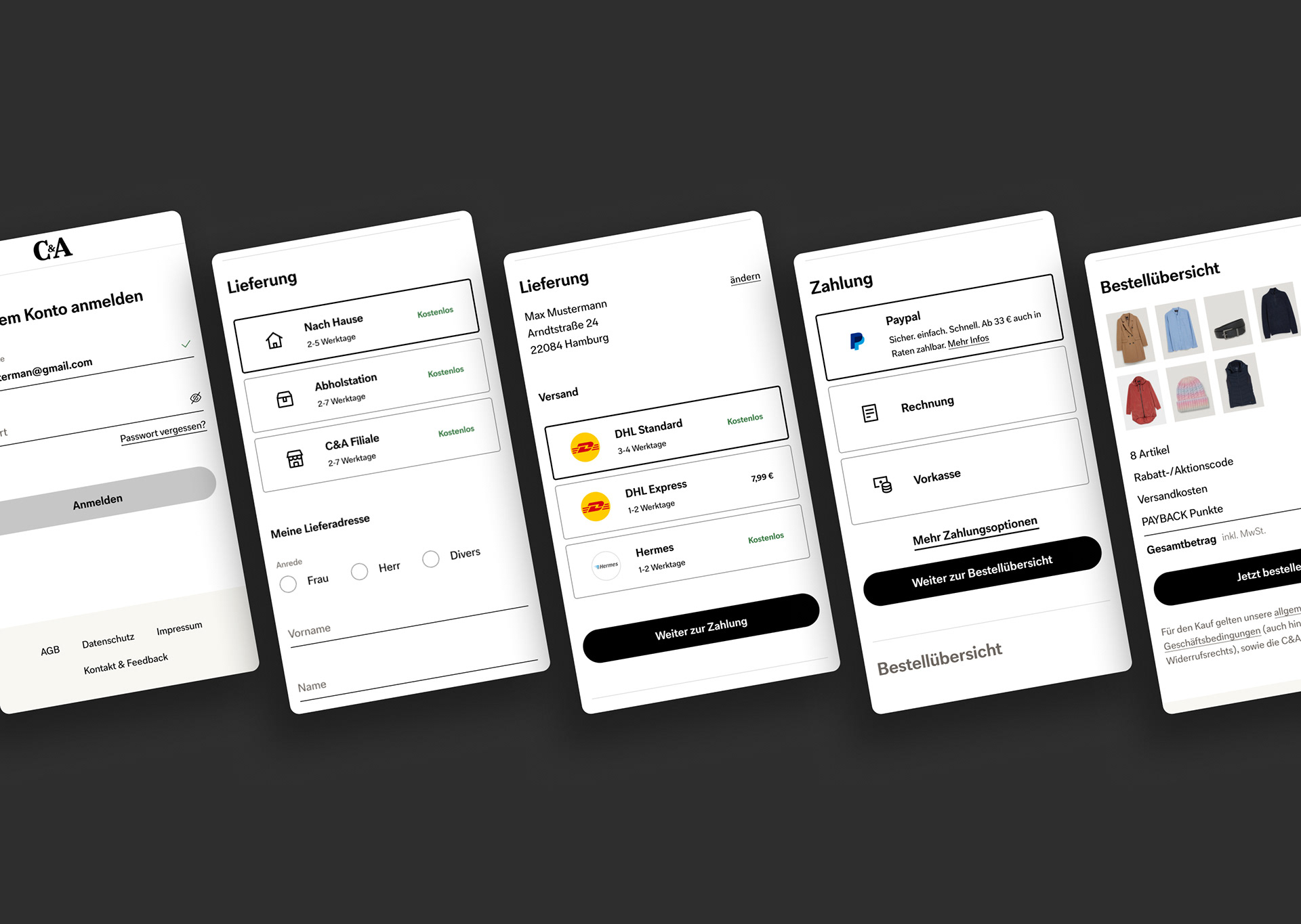
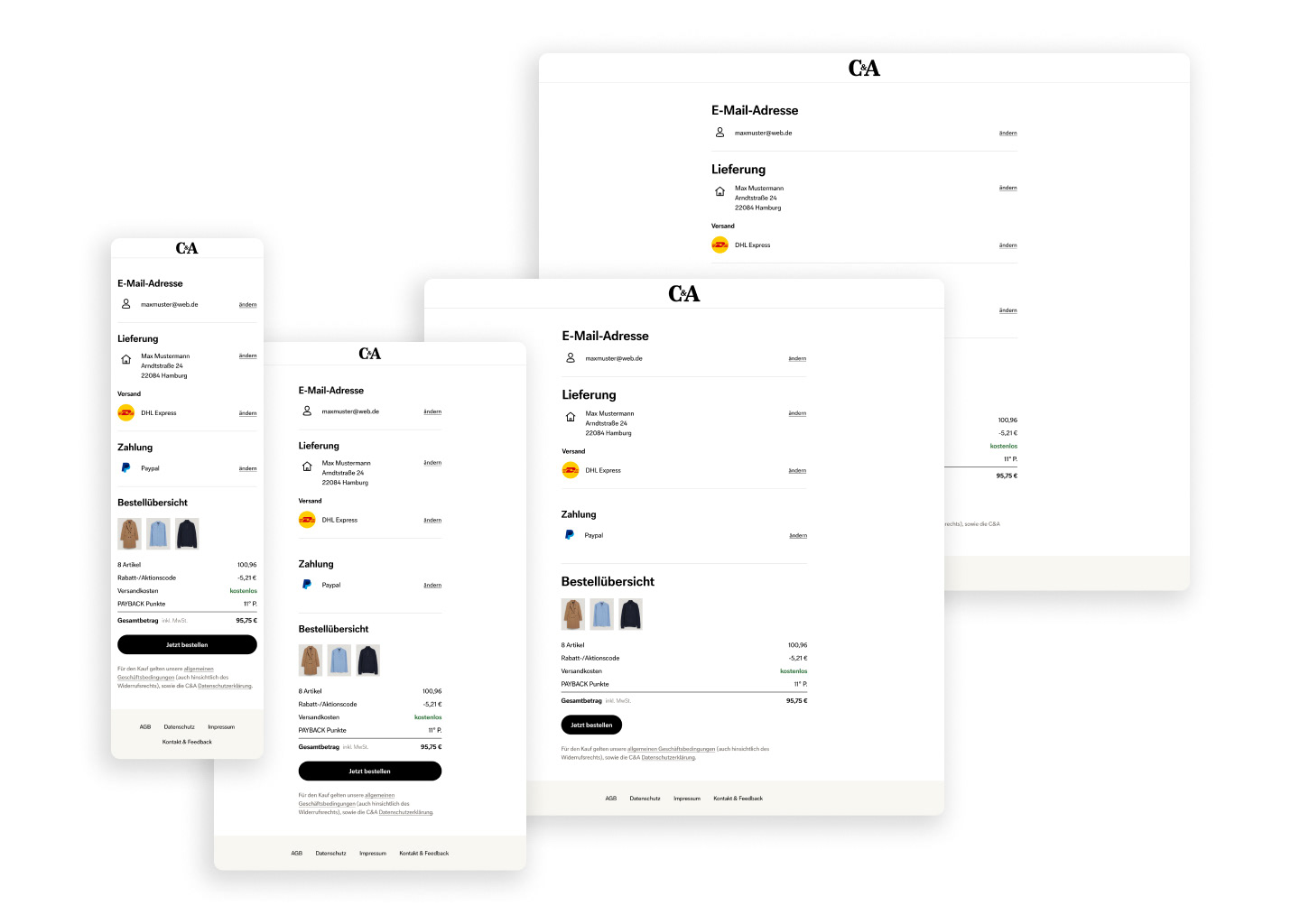
C&A is one of Europe’s leading fashion retailers with over 1,400 stores in 18 countries. During its digital rebrand, I led the UX and UI design for the new checkout experience as part of the modernization of C&A’s technical architecture.
I noticed that users often struggled to compare product details and lost orientation in the multi-step checkout. Through iterative prototypes and five moderated user tests, I refined the flow to make navigation more intuitive and decision-supportive.
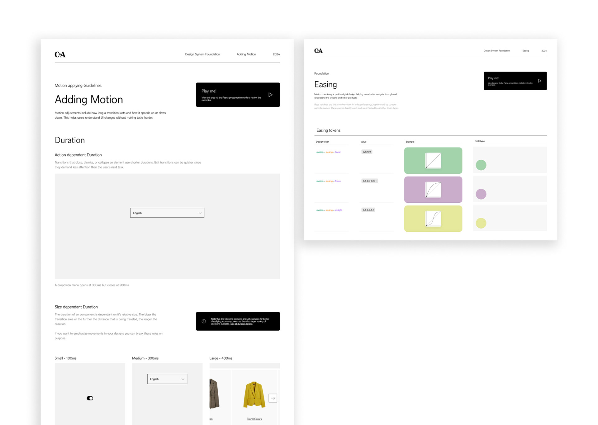
My redesign clarified the information hierarchy, improved visual feedback, and aligned motion design with the new brand language. The result: a smoother, more confident purchase journey that increased checkout completion rates by around 15% during A/B testing and reduced support inquiries related to checkout confusion.
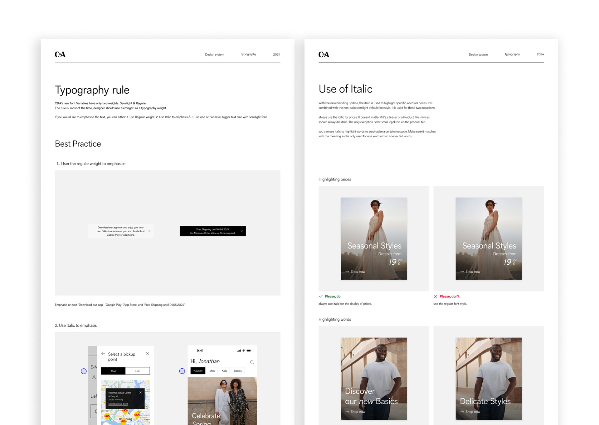
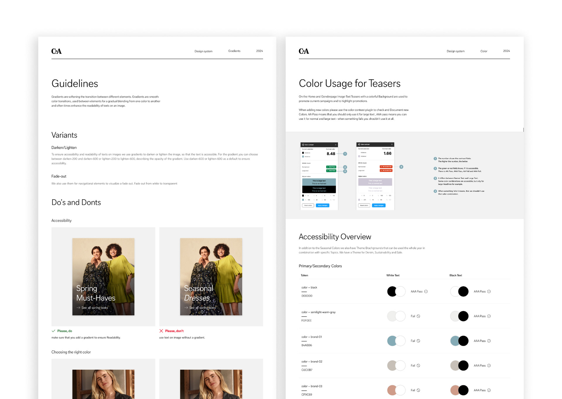
What I did: UX design, UI design, prototype, product design, design system, user testing, animation, documentation
Team: David Ureña Molina, Jennifer Döpper, Frauke Brandt
2022/23 for Dept Hamburg